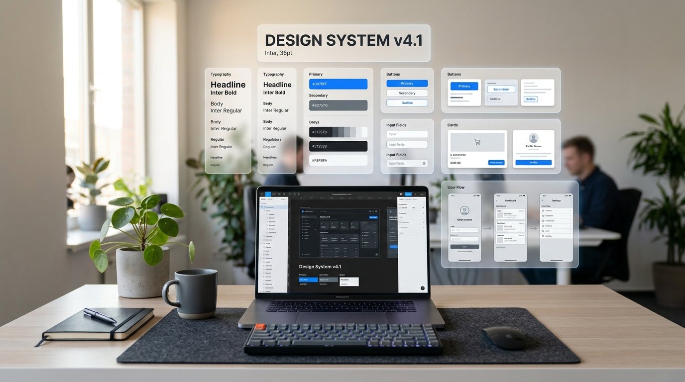
A design system is far more than a Figma sticker sheet or component library—it is the single source of truth that aligns design, engineering, and product teams. When built correctly, a scalable design system accelerates feature velocity and eliminates UI fragmentation.
The Foundations: Design Tokens First
Before drawing a single button or modal card, define your global and semantic tokens: color palettes, typography scales, spacing units, border radii, and elevation shadows. Semantic tokens (such as --surface-interactive-hover) protect your system when theme variations or dark modes are introduced.
Atomic Hierarchy & Component Architecture
Break your interface into structured layers that mimic component hierarchies in modern frameworks:
- Atoms: Icons, typography tokens, color swatches, button labels.
- Molecules: Search input fields, avatar badges, notification pills.
- Organisms: Navigation headers, course cards, lesson progress sidebars.
- Templates: Dashboard layouts, lesson player views, modal dialogs.
Bridging Design to Code
Modern engineering stacks expect design system parity. Utilizing Figma variables that map directly to Tailwind CSS configuration or CSS custom properties ensures zero lost-in-translation errors during sprint reviews.
Governance and Evolution
Establish a clear contribution workflow for new patterns. A design system is a living product that requires regular audits, accessibility checks, and versioned releases.